
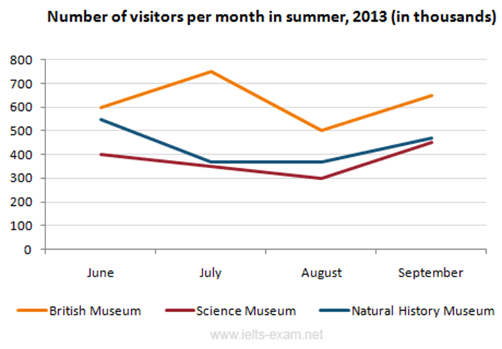
The line graph below gives information about the number of visitors to three London museums between June and September 2013.
Summaries the information by selecting and reporting the main features, and make comparisons where relevant.
Write at least 150 words.
Model Answer
The provided line graph shows how many people visited different museums located in London in the summer of 2013.
Overall. In start of summer majority of people visited the British Museum while people had least interest in Science Museum. While the Natural History museum was the only museum which experienced down fall trend during the given time period. At the end British and Science museums showed marginal increase. Fluctuation also can be seen in all museums.
In the month of June 600 thousand people visited the British museum. Although the Science Museum and the Natural History Museum received almost 550 and 400 thousand visitor respectively. In next month British museum showed upward trend while other museums figure faced downward trend . The number of people who visited the Science Museum dropped gradually from 400 thousand to 300 from June to August then rose to 450 thousand in September. As can be seen that the trend for the Natural History Museum was comparable. There was a sharp drop in visitors from June to July. in August all listed museums exhibited upsurge trend. British museum reached at approximately 650 K visitor while science and Natural history museum touched nearly same point 450 k visitors.
(201 Words)